Starbucks Mobile App - UI Redesign
The challenge
The challenge is to understand Starbucks users' response to the current mobile app, discover pain points and propose a solution to improve their experiences.
Timeline
2 weeks
My Role
Sole end-to-end designer, from research right through to UI
Tools
Figma, Miro
RESEARCH
Guerrilla Usability Testing
I first did research to understand the main features of Starbucks mobile app on their official guide, and read App Store reviews. During the testing phase, I spoke with 5 users to uncover pain points while using the mobile app. 3 out of the 5 users have used Starbucks App in the past. 2 out of the 5 users have not used the App. I gave each user three different tasks to complete within the app:
SYNTHESIZE
Take-aways from the Usability Testing
The findings from my research were organized on an affinity map to better understand their relationship to each other and to determine priorities moving forward in the process. With the short timeline for this project it was important for me to understand what I should focus on that would lead to maximum benefit to the app.
IDEATE
User Flow
With my research in mind, I developed user flows to accomplish 3 key tasks. These included showing a QR code to pay at a store, ordering a favorite coffee, finding the store user will order ahead (mobile order).
This is the flow that was developed for the ordering a favorite coffee:
Low-Fi Sketches
Based on the established pain points, I sketched multiple options to test and see how by initiating minimal changes to optimize the user experience. During the process of redesign, I continued referring to focus on how to improve the user experience rather than making design changes. After a few rounds of iterations I came to a good place with the solutions.
PROTOTYPE
Hi-Fi Prototype
Moving forward with the process, I turned my Lo-Fi sketches into Hi-Fi prototypes. Below are the screen comparison showing before and after side by side.
Learnings + Reflections
I have gained in depth knowledge about UX processes and best practices, to a level that I am confident I could apply it to any brief I am given. Although I had a very short timeline for this project, I am glad to learn that even by making small changes, we are able to yield big impacts and create a great experience for users.
Note: I do not work for, nor am I affiliated with Starbucks. This UX study was done as a learning experience for me to explore products I love and how to make it even better.
Thank you for scrolling! ✨
VALIDATE
Usability Test (second round)
Base on the research, here are the 4 problems I decided to focus on:
No one used the 残高¥-- (remaining balance) button on the home screen to show QR code.
The home screen could be confusing for new users due to the variety of functions.
When users want to order favorites at a different store, there is no easy way to order favorite drinks.
Users worried if they are choosing the right store when they make a mobile order.
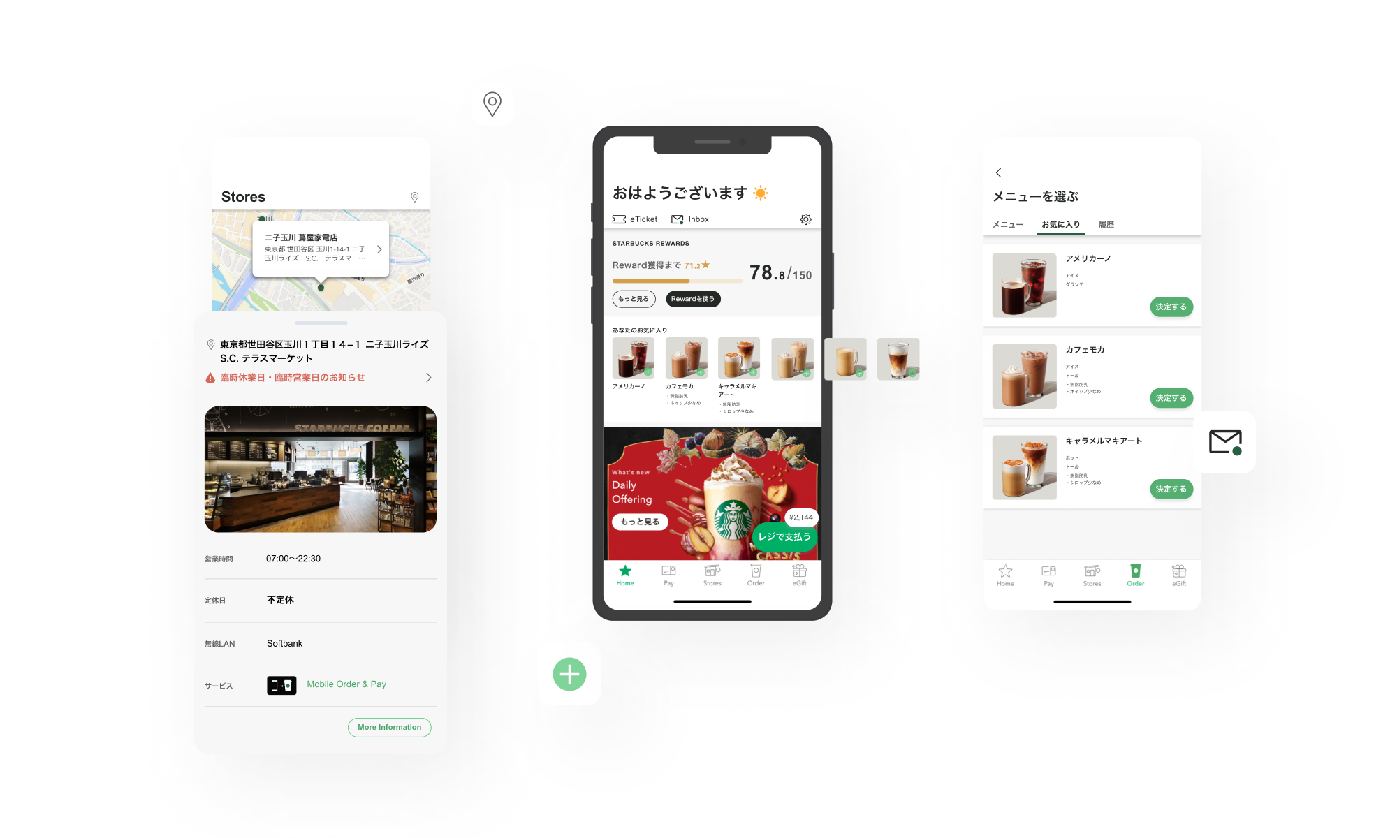
Home Screen: Main focus here is the mobile order & pay banner was changed to Your Favorites (あなたのお気に入り). Now, frequent users are able to add their usuals with less actions. Also, mobile order is accessible from the bottom navigation bar (the Order icon).
Drink Menu: Favorites and History tabs were created on drink menu page. Users had to scroll down the long menu page before, now they can find favorites and history quickly. This establish users’ loyalty.
Find a store: Based on reviews on app store, I also changed screens for finding stores. It used to have only text, which made users to find the right store, especially there are more than one store at the area. Implementing a picture of a store leads users to find a right store intuitively.
After two weeks of user research, analysis and redesign, I was able to validate the assumptions and changes I had made. I did this by testing my clickable prototype with five users. The results are:
Finding QR code: 5 out of 5 users clicked the レジで支払う (Pay at the register) button on home screen within 3 seconds.
Ordering a favorite drink: 4 out of 5 users were able to find and place an order straight from home screen.
Ordering a drink from history in a different store: 5 out of 5 users were able to find it quickly.
Finding a store: 5 out of 5 users said it is easier to find a store with a picture of a store.
*Though I conducted this usability test to gain quantitative data, the last question was hard to measure. So I interviewed and asked users preference between the current or new design.


